Case study · Web
A portfolio that introduces me before I say a word.
The site you're on right now. One face, split down the middle (frontend on the left, backend on the right), with a slider that follows your cursor. Built by hand, no page-builder, no template.
Overview
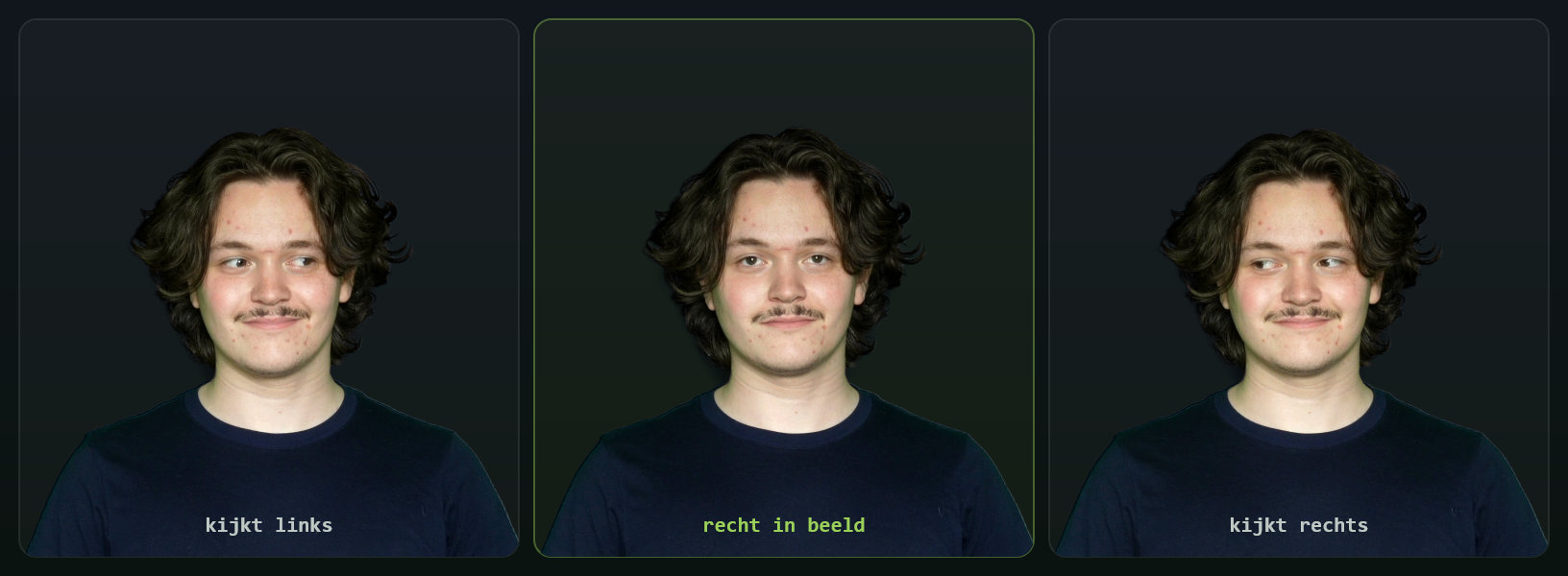
Most developer portfolios open with a wall of text. I wanted mine to show the frontend/backend split instead of explaining it. So the hero is a single portrait of me, cut down the middle: a bright, creative frontend on one side and a dark, technical backend on the other, and because each half looks the other way, my eyes follow your cursor across the seam.
One face, two sides: the whole frontend ↔ backend idea in a single image.
Every animation earns its place: the gaze, the zoom-out, the signature.
Hand-written HTML/CSS/JS: fast, responsive, accessible, and easy to extend.
Signature feature
Scroll past the hero and the banner pins, zooms back like a card being placed on a desk, and my signature ED gets drawn on top, stroke by stroke, in the exact order I write it by hand. It's an SVG mask wiping along the pen path, tied to scroll progress.
Details
The gaze
The banner blends three photos shot in the same spot: looking left, straight at you, and right. At rest you get eye-contact; the moment the split moves, the matching gaze fades in. No cross-eyed glitch, just a face that follows you.

Responsive
A recruiter might open this on a train, on their phone. So on small screens the split collapses into a clean, centered frontend / backend lockup over the portrait, fully legible, no overlap, no horizontal scroll. Same idea, sized for a thumb.
Under the hood
No framework for the structure: just clean, semantic HTML and CSS so it stays fast and easy to edit. The scroll choreography runs on GSAP + ScrollTrigger with Lenis smooth scroll, and the signature is a hand-traced SVG path revealed through a mask.